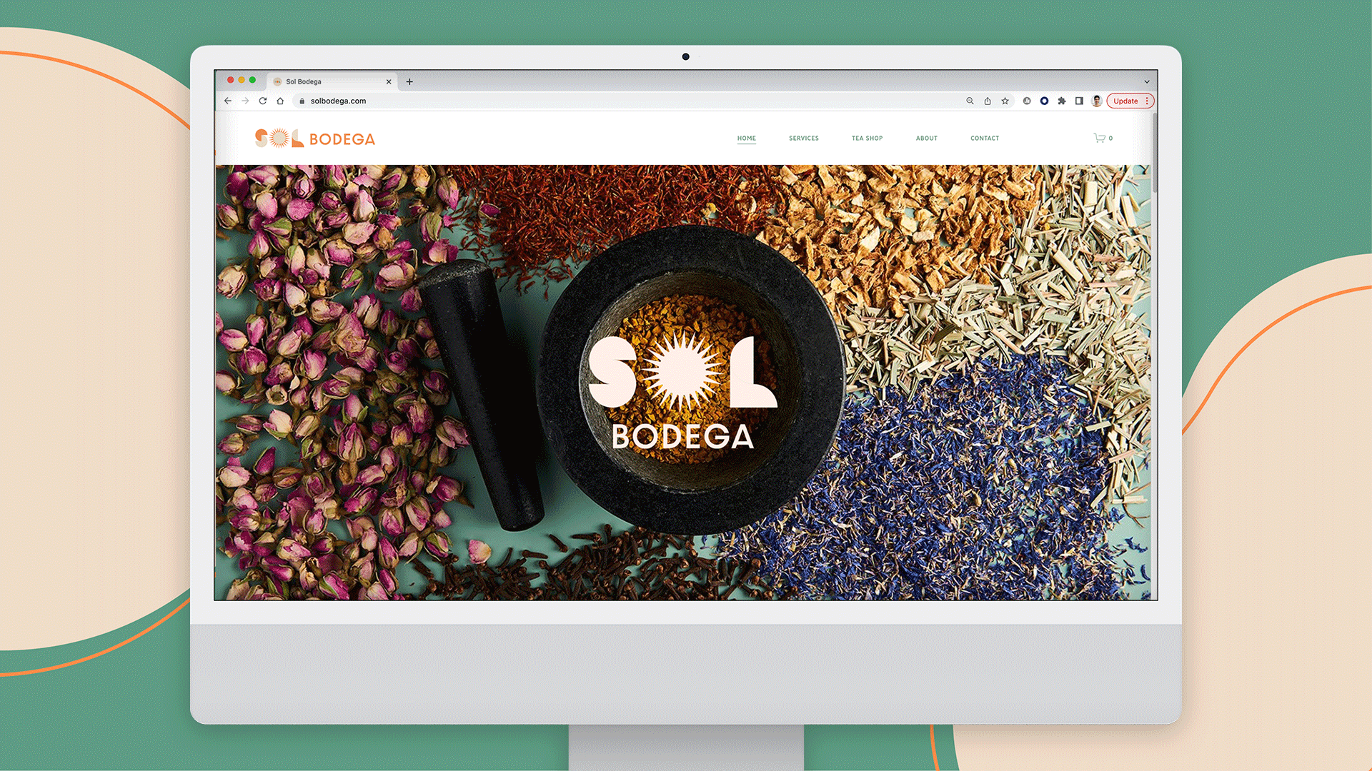
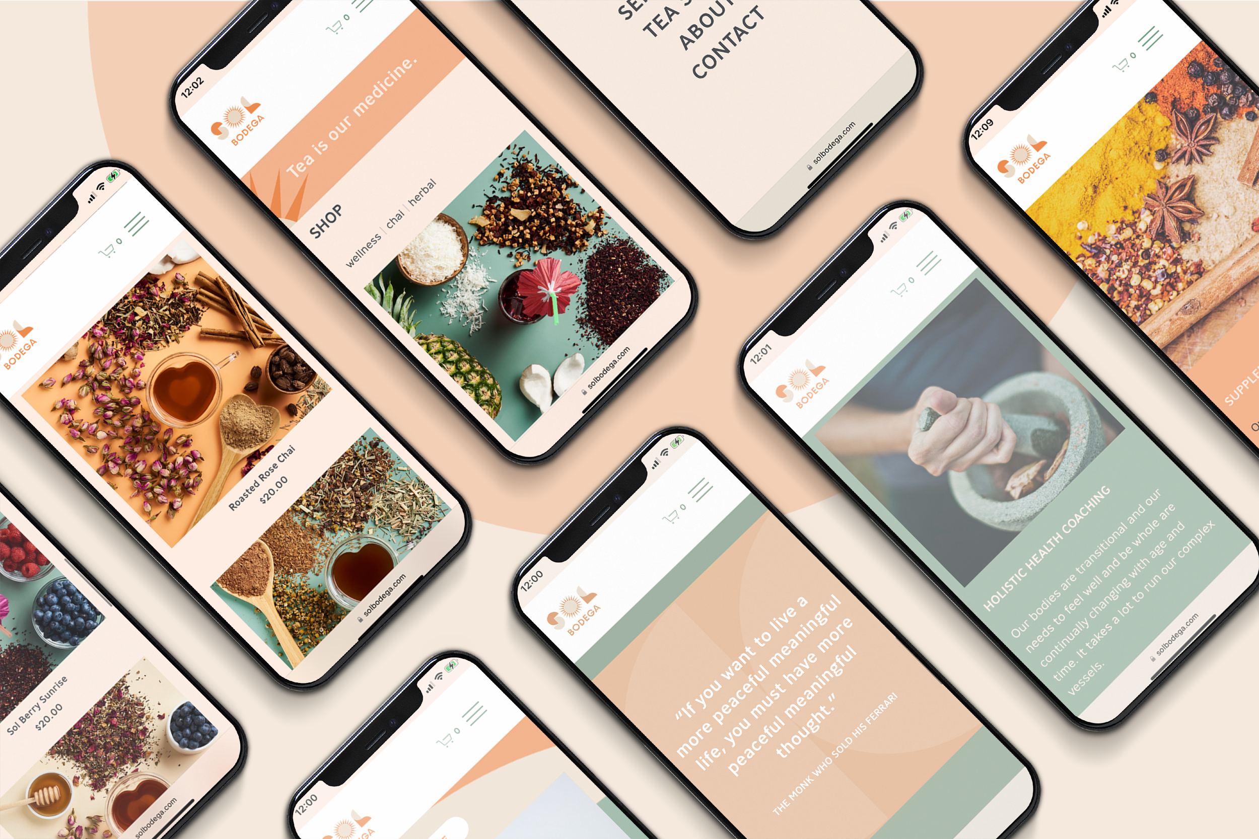
Sol Bodega is a wellness company offering herbal teas and coaching to people who seek holistic alternatives for healthy living.
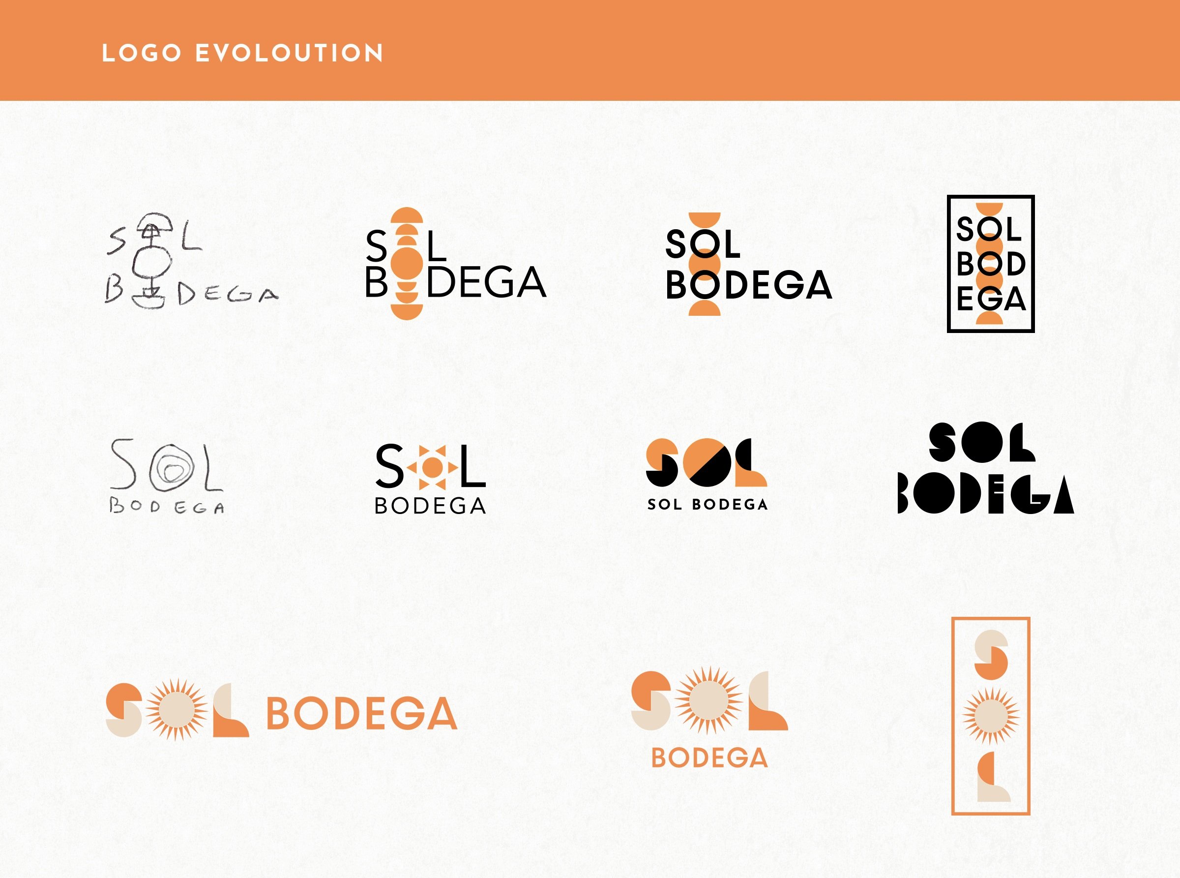
The objective was to create a bold and vibrant visual identity inspired by the accessibility of bodegas from the client’s Bronx roots.
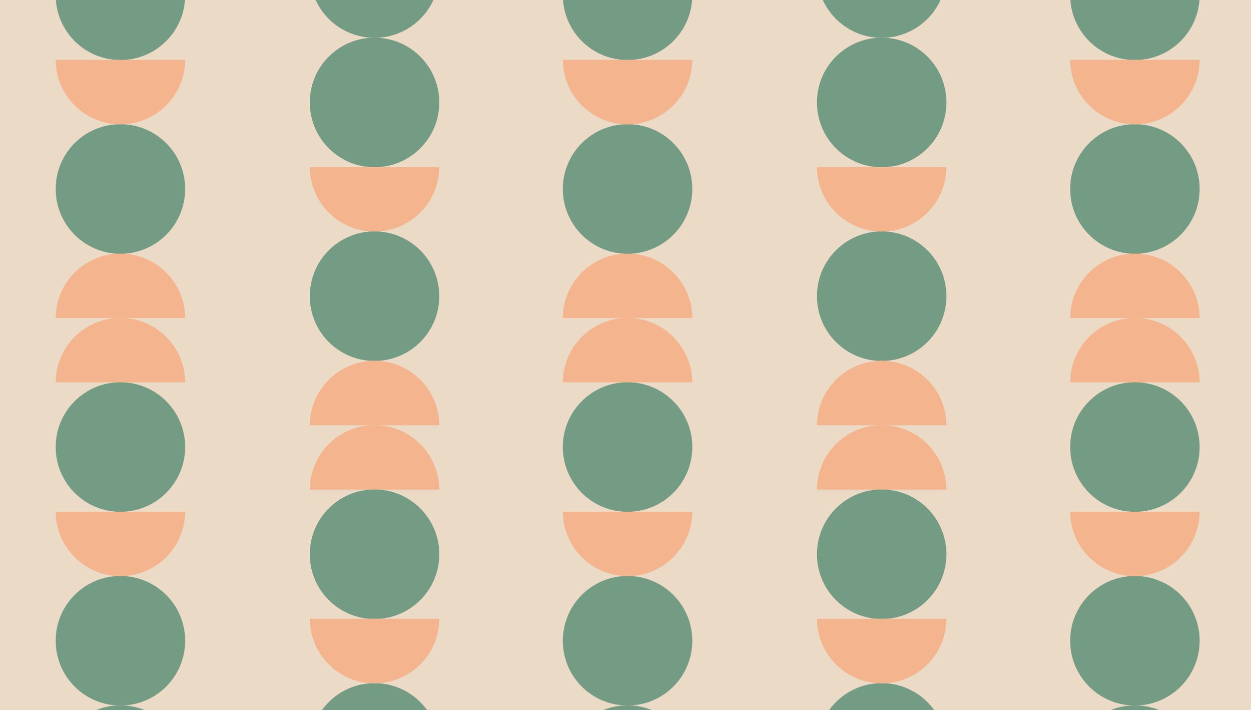
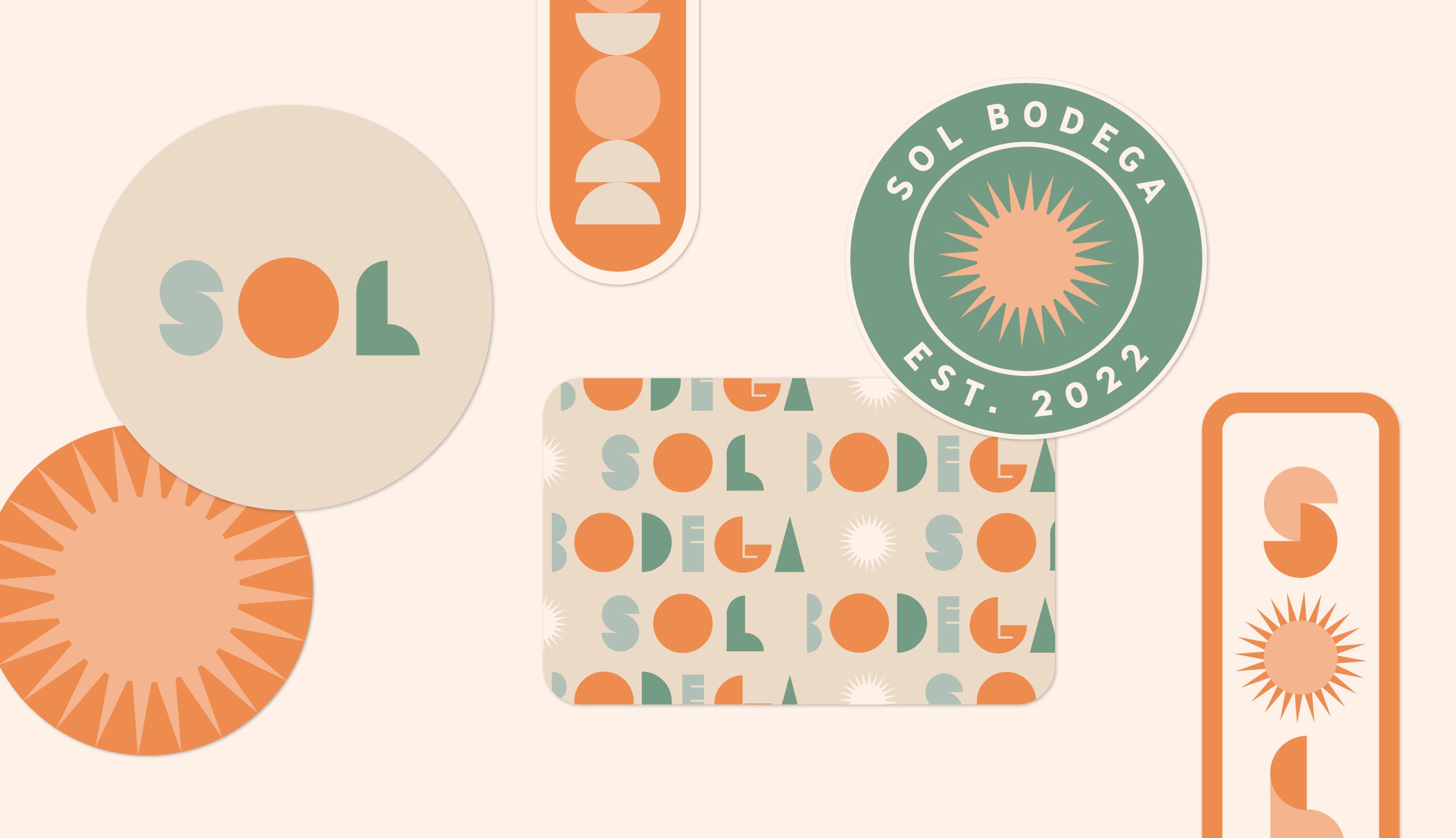
Approach: For "Sol Bodega," we crafted a visual identity that embodies the Sun's radiant essence and incorporates earthy colors reflecting the brand's holistic philosophy. We designed unique patterns symbolizing energy chakras and cairns for packaging and promotional materials, while a user-friendly website effectively promotes herbal teas, coaching services, and wellness resources, aligning perfectly with the brand identity.
My role: designing the logo, visual elements, patterns, website, and photography direction
See the website here solbodega.com
Art Director: Jac Kirby, 7 Layer Studio